
Slotshotellet is a local hotel from the center of Aalborg, Denmark. Due to the COVID19 pandemic, many hotels had to close their doors, but very few saw an oportunity for growth. Slotshotellet was one of the few who used the "quiet days" into their advantage. They contacted us about a complete branding of the hotel, a challenge which we happily accepted.
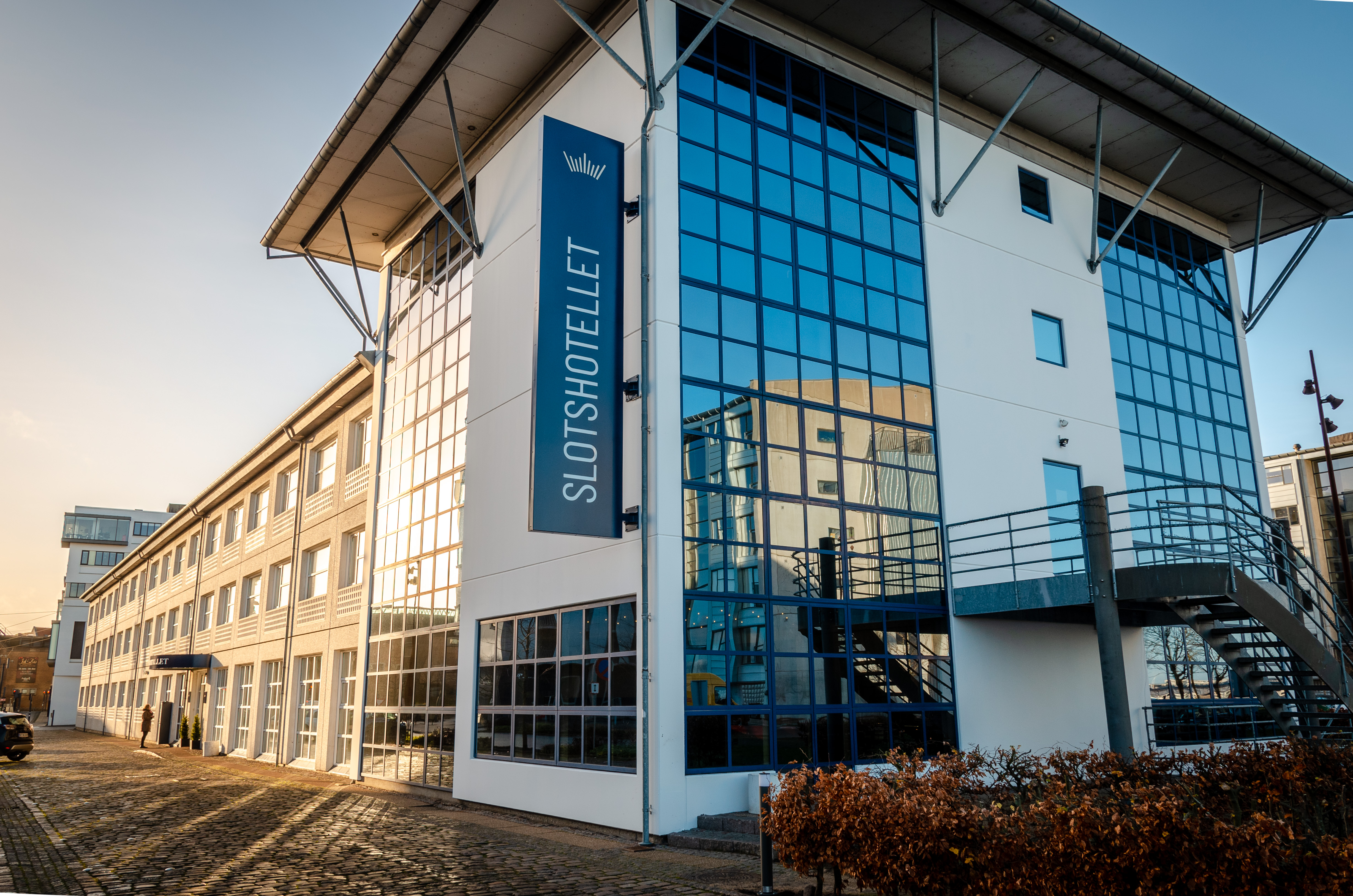
Slotshotellet Aalborg is aiming to position itself as the primary choice in Aalborg when it comes to local experiences, as well as combining modern with old within the hotel. Such as the city of Aalborg is a union of its historic industrial setting and the modern, vibrant spirit of innovation, so is Slotshotellet Aalborg also a fusion of its historic roots and the practicality of modern technology. The name Slotshotellet means "Castle Hotel" translated from Danish, therefore the visual identity of the brand had to have.

The hotel’s personality is a discreet blend between its history and its modern approach to hospitality. It respects heritage and it evokes loyalty in people, by reaching out to their feelings in the service encounter. The hotel aims to emphasize what needs to be seen in the city of Aalborg, and know all of the city’s hidden gems, providing the guests with unique and authentic experiences. It aims to enhance the customer experience through technological improvements to the booking process, check-in, check-out and movement on the property. The process from booking to check-out and beyond is meant to be easier than ever with the systems in place at Slotshotellet Aalborg. The features will include self check-in, express check-out, keyless entry to the rooms, digitized goodie packs and parking, and much more.


A key factor in designing the visual identity was to convey the hotel's unique personality into clear visuals that are easy to understand.
The logo was made using 9 uneven lines shaped into a crown form. As for the typography, blending the old and new was the key. A classic serif font was chosen for the headlines, combined with a simple sans serif font for the body text.

One of the biggest challenges when working on a project of this scale is to make sure all the design elements fit together, blending the old and the new into a seamless picture without compromising the brand values and message. It is especially important to consider how will the client get into contact with all the design elements and to make sure there is always a balance between old an new.
Photos are especially important for presenting a hotel. Therefore we planned a few photoshootings with the staff and the hotel rooms, to better showcase the hotel values and to send a unified message to their audience.


In order for a visual identity to work as intended, consistency and correct use is the key. Therefore a branding manual was created and we offered training for all the hotel employees in order to properly use all the materials we created. The logo, e-mail signatures, contract templates and other documents were just a few of the materials that the team was trained to use.


Once in a while we create offers for our followers and clients. Make sure you’re subscribed so you won’t miss our next e-mail.
Don’t worry. You won’t receive more than one e-mail per month from us.